Work
Customer journey, User flow, Prototyping
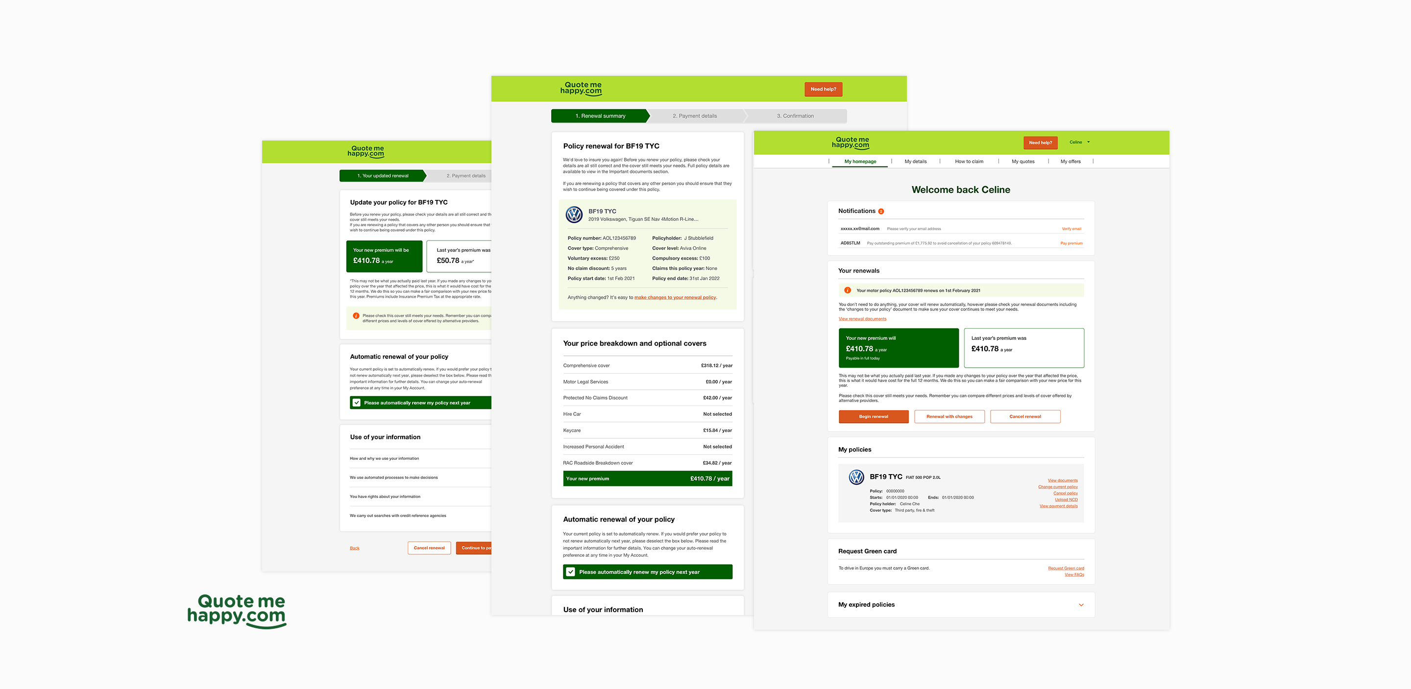
Motor Insurance Renewal
A strategic transformation of the renewal journey to enhance customer retention by promoting product loyalty and providing a streamlined experience at every step.
Helping customers understand their cover, make changes and renew with confidence.
The problem
Journey
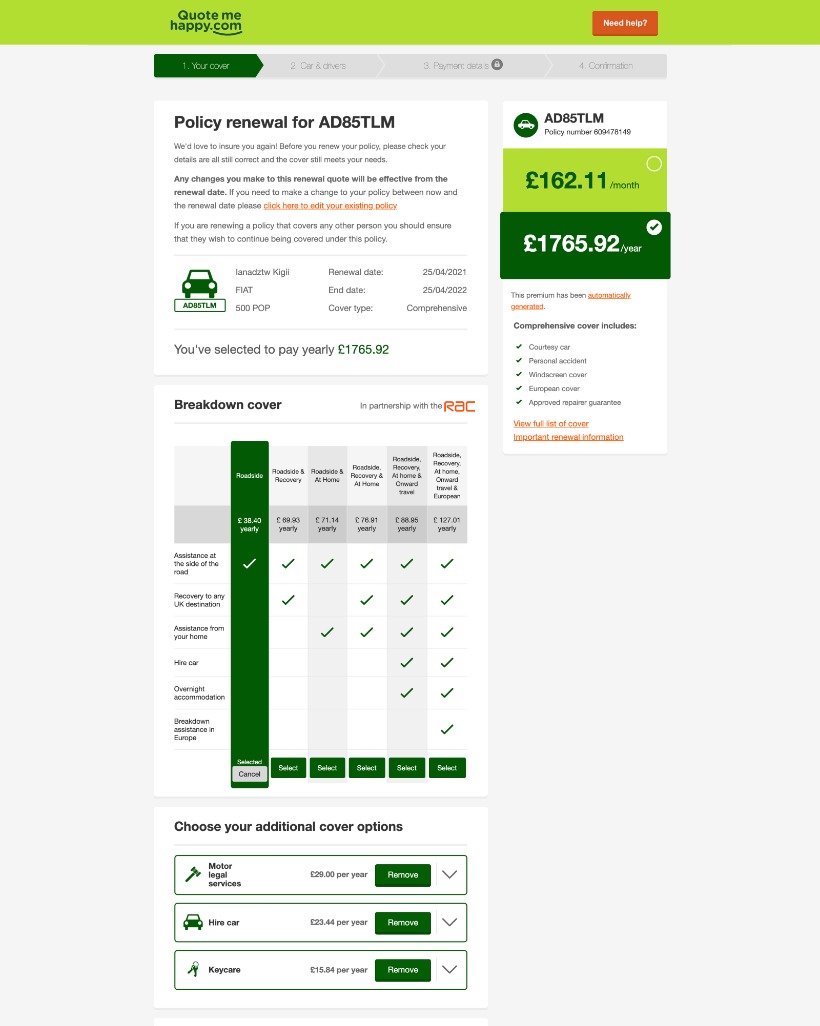
The existing renewal journey placed editing details, payment and confirmation on a single page. Customers had to work through a lengthy editing screen even when nothing needed updating, making it hard to see what required action or where they were in the process. At a critical point for customer retention, this unnecessary effort increased the risk of customers abandoning their renewal.
Touchpoint
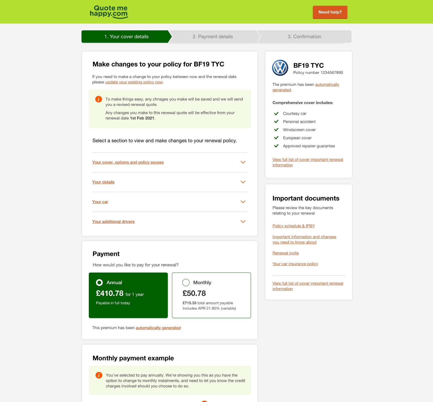
The renewal invitation was the first touchpoint to give customers a clear reason to stay. Its dense layout buried the cover details they cared about and made the next step harder to understand. This created a risk of losing customers before they had even started the renewal journey.
Before
After
Key contributions
Redesign the renewal flow
Proposed clearer steps for editing details, payment and confirmation, with a route that did not require every customer to work through the full editing process.
Redesign the renewal invitation
Prioritised cover details and made the option to change a policy easier to find before customers began renewing.
Research
Worked with researchers in WebEx with 6 participants, who wereall coming up to renewal or just through one. Half were Aviva customers and half were not.
What the interviews showed
1
The structure made sense, but the effort did not
Participants understood the broad stages of renewal. The difficulty was working through the detail, particularly when they had nothing to change. Aviva customers also expected the invitation to lead to My Account.
2
Details before continuing
Everyone scrolled the important details in the email before continuing, and took extra care with a purchase or renewal.
3
Automatic renewal was misunderstood
Automatic renewal was not clearly understood. Some read the opt-in as agreement to general purchase terms, not automatic renewal terms.
4
Driving needs had changed
Driving patterns had changed during COVID. Many were unsure whether mileage and car use would change at renewal.
5
Changing a policy was unclear
Making a change inside the journey was unclear. A few considered cancelling and starting a new policy instead.
6
The price comparison lacked meaning
The renewal transparency content did not land. The previous year’s price for a changed policy did not provide a useful comparison.
Design direction
- Make the steps and progress of renewal clear.
- Help customers understand and update their cover without unnecessary effort.
- Support more confident decisions and improve renewal retention.
Solution - A clearer renewal flow
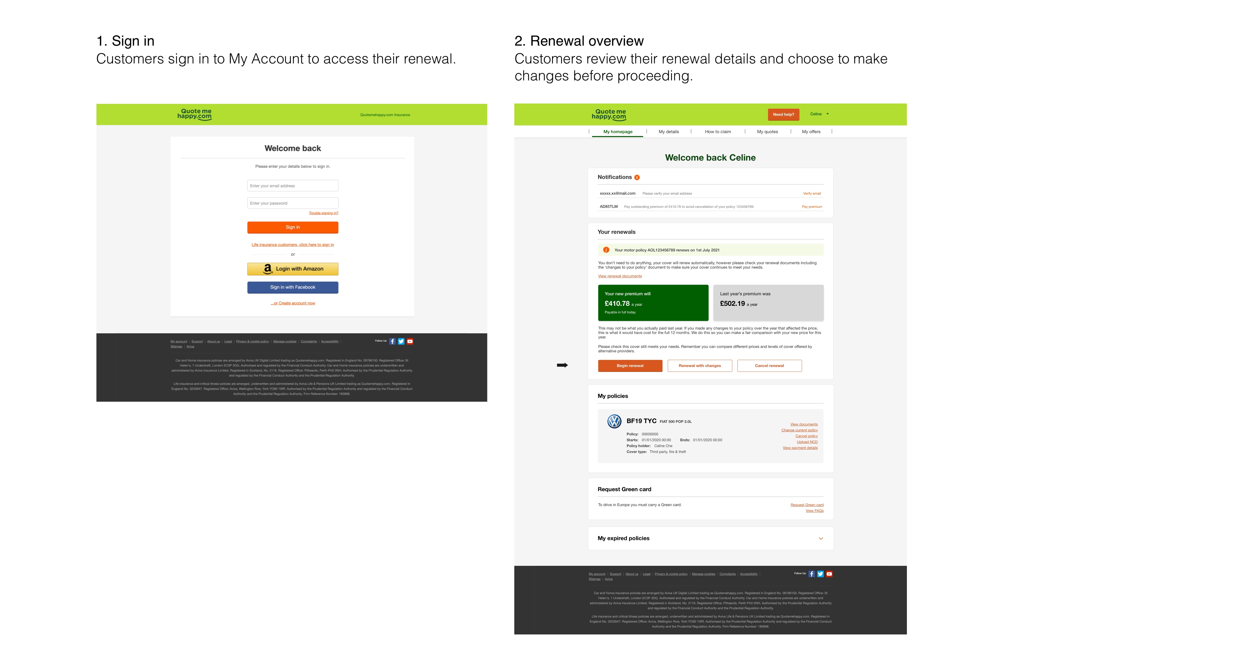
I explored a journey that made renewal accessible from My Account and separated the work into clearer stages. Customers with no changes to make would not need to navigate the long editing process, while those who did need to update their policy could see how to do so.
Proposed journey
Flow 1 | Renew without changes
Access renewal in My Account
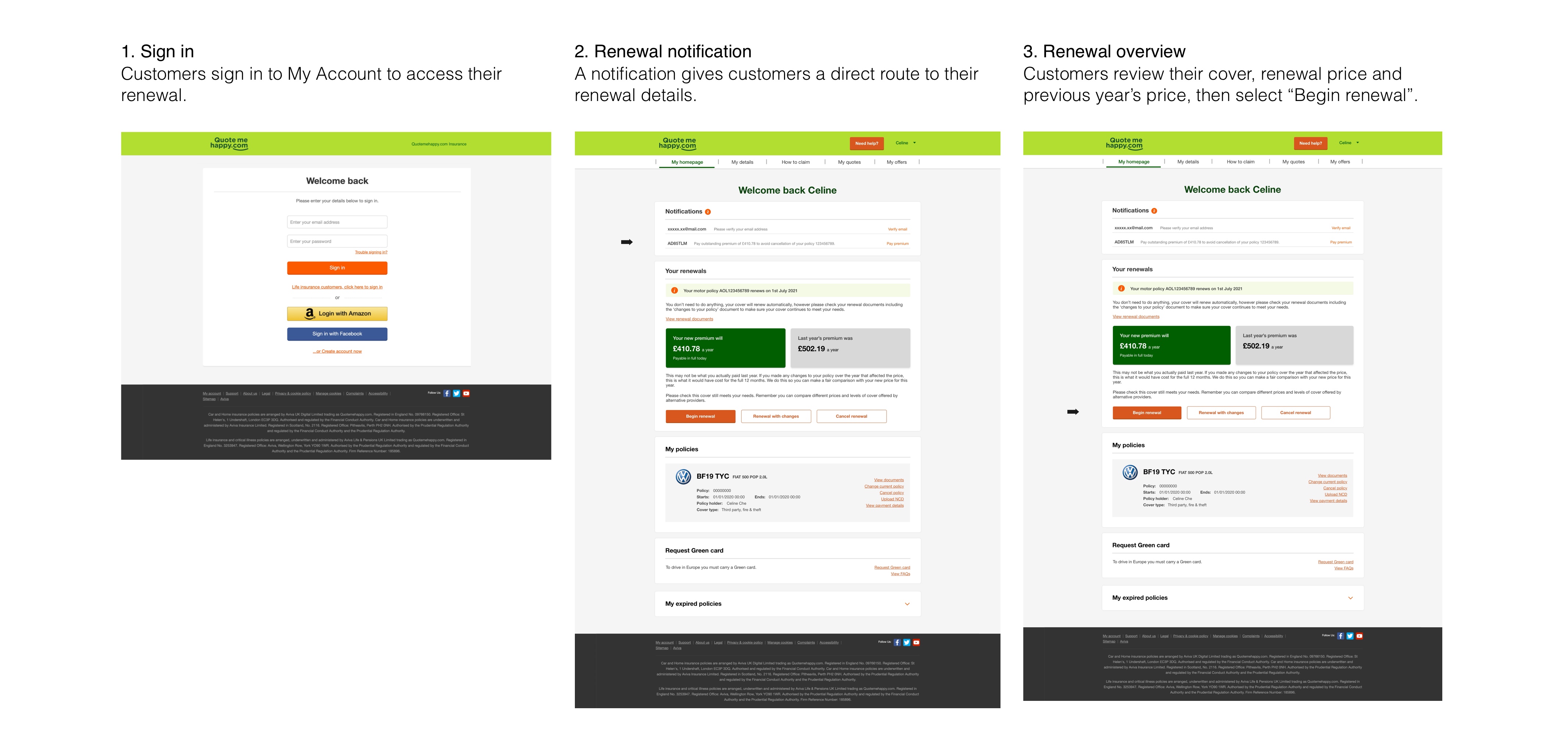
Review cover and price
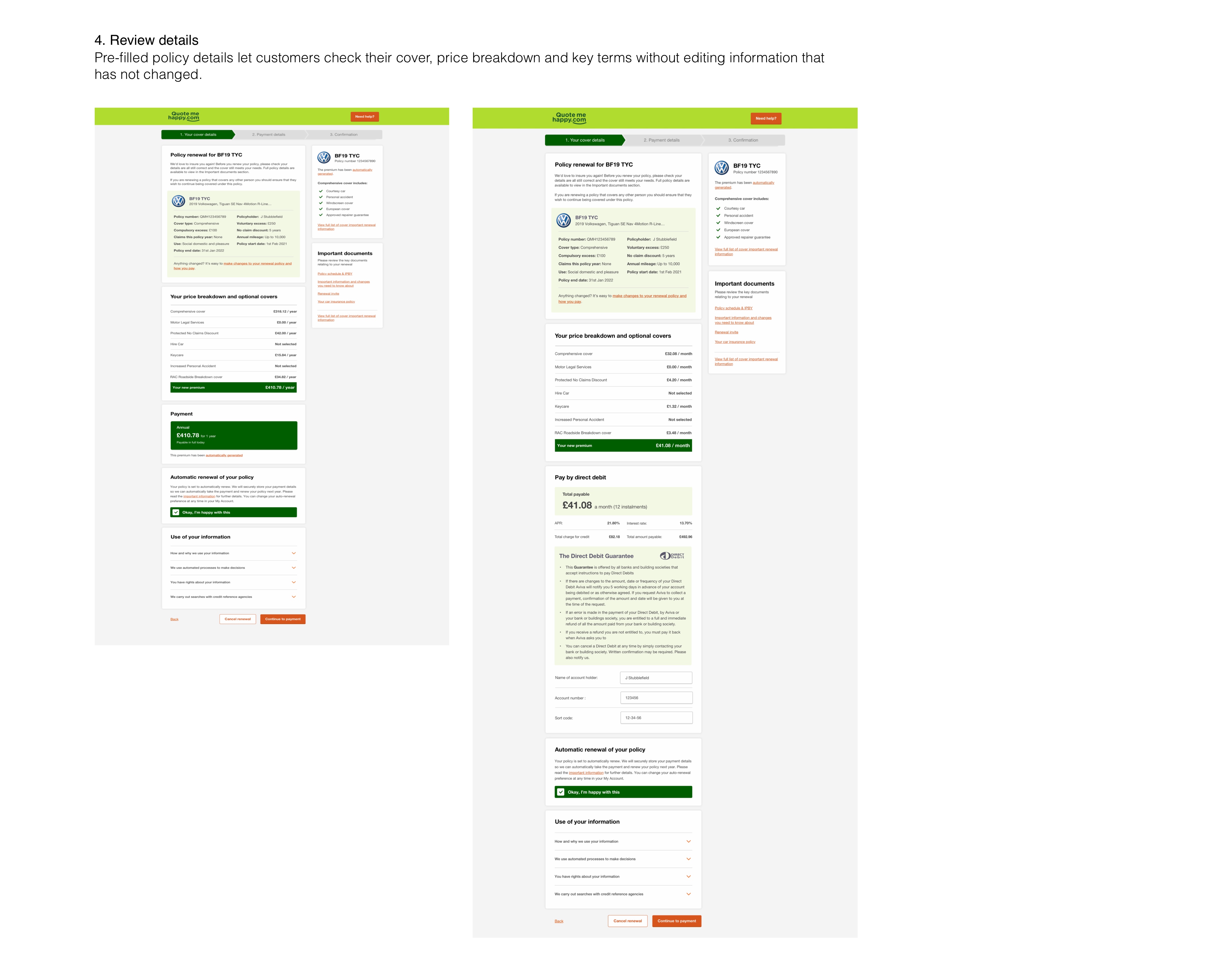
Choose how to pay
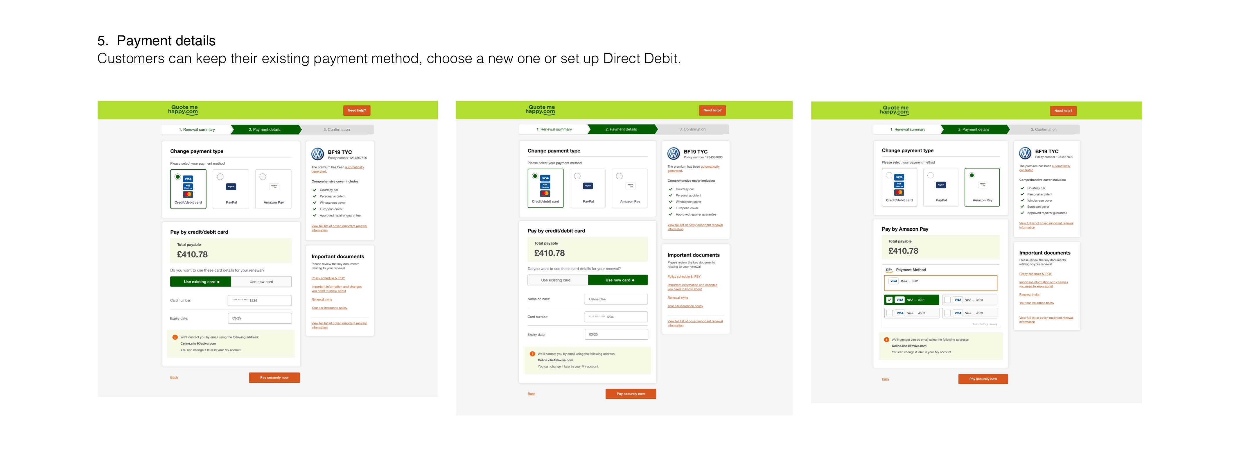
Flow 2 | Renew with changes
Access renewal in My Account
Update details and review the price
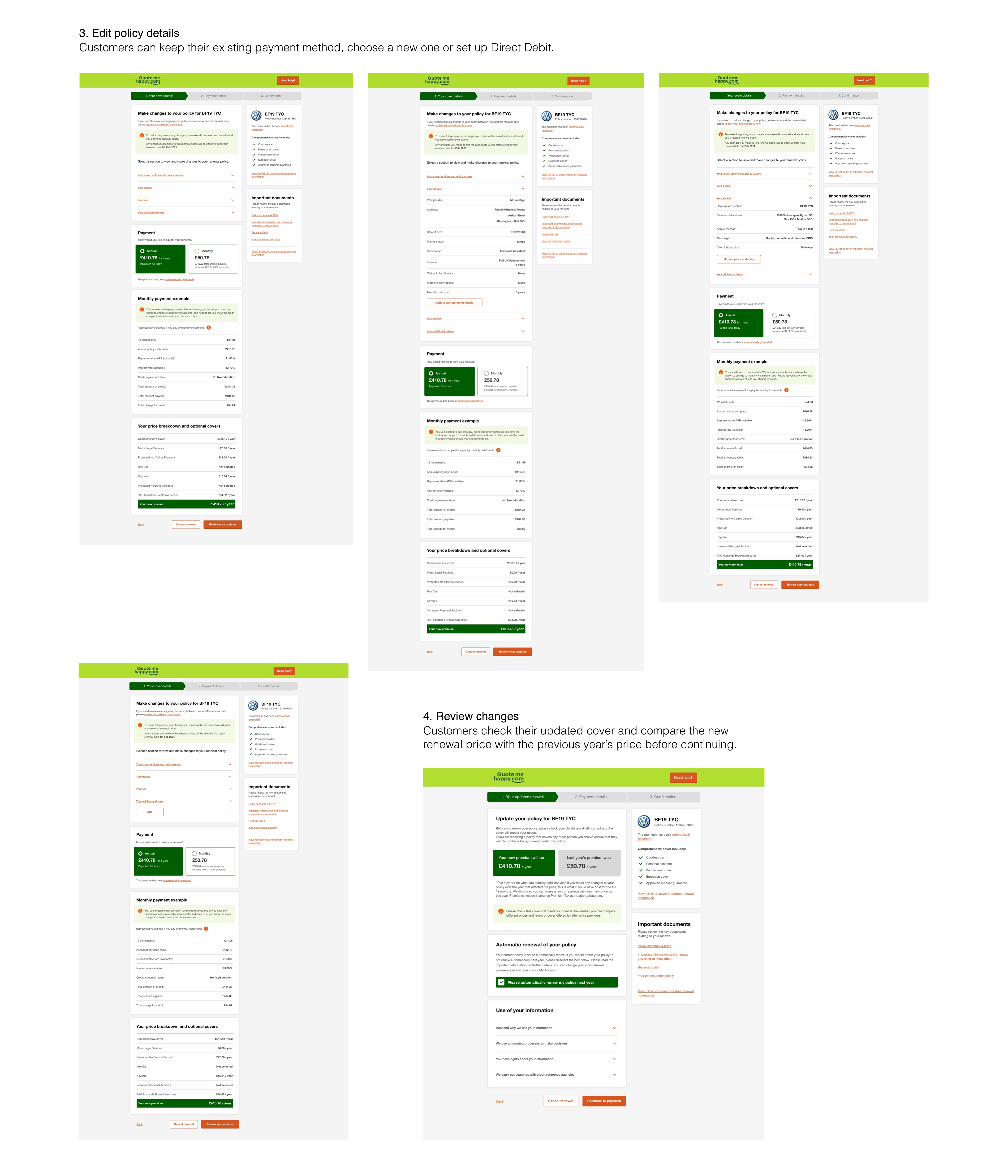
Choose how to pay
Solution - A more useful renewal invitation
The email needed to work as more than a prompt to click through. Research showed that customers read their cover information before proceeding, regardless of where the call to action appeared.I reorganised the invitation around those details and made the option to change a policy more visible. This helped customers understand what they were renewing and what they could do next.
Left: before, Right: after
Result
In the month following the invitation email change, reported retention increased by 1.4 percentage points for motor and 2 percentage points for home. Across the two products, Aviva reported approximately 25,000 additional policies in force.