Work
Product design, Information architecture, Interaction design, Branding, Illustration.
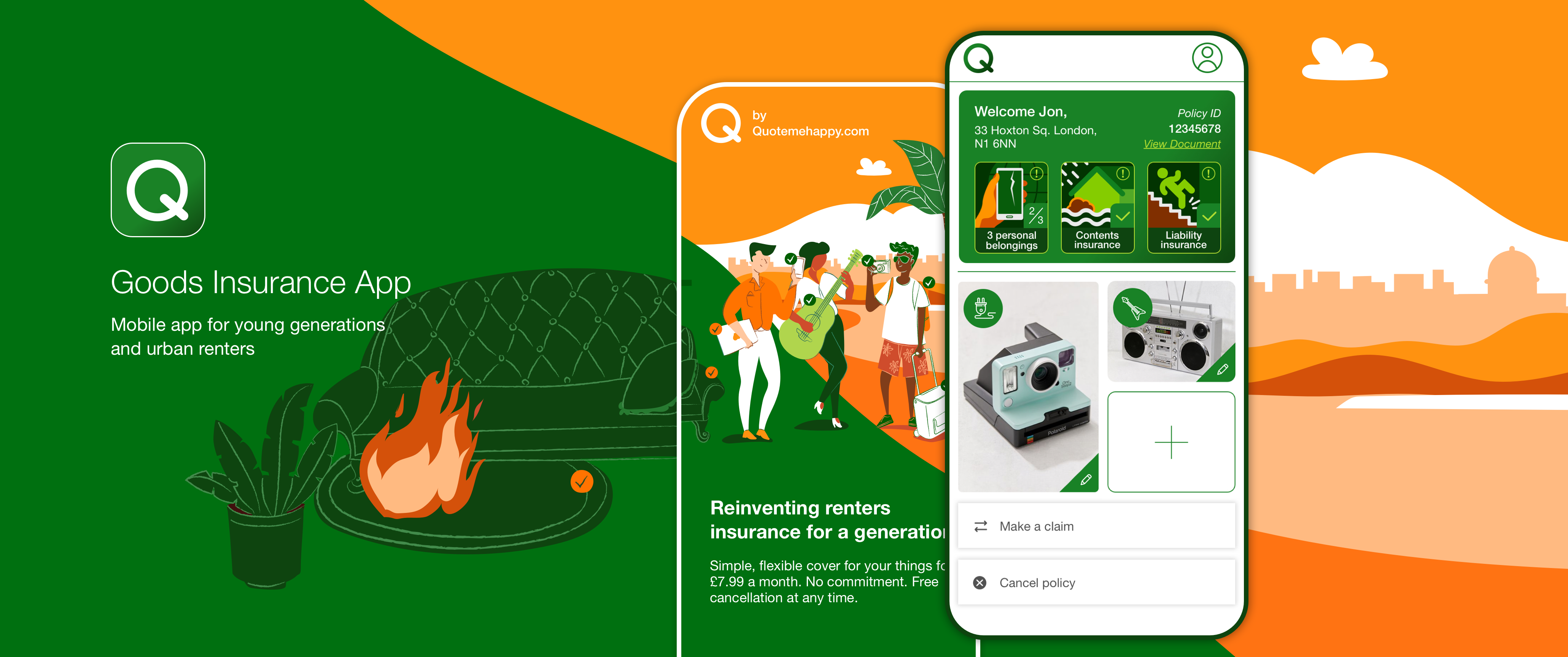
Q - Goods insurance app
Designing a new insurance product for young urban renters, from the app experience to marketing and launch preparation.
Project overview
Q is a new insurance product developed for young people renting in large cities such as London. The concept recognised a sizeable audience and an opportunity to create a product around their lifestyles, belongings and insurance needs.
The native mobile app sits at the centre of the experience. Supporting product pages and promotional materials introduce the offer, while the app helps users purchase cover, add insured items, manage their policy and make a claim. My design work extended across these touchpoints and into the detailed revisions needed to prepare the product for launch.
Product opportunity
The initial concept focused on making insurance relevant to young urban renters. Their needs informed the product itself, alongside the experience of understanding and using it.
Q combines cover for belongings at home with protection for selected items users take with them. Users can photograph and add individual items, then change their selection as their needs change. This flexibility connects the product to everyday situations, such as replacing a covered item or taking different belongings on holiday.
The design challenge was to explain this offer clearly and make it straightforward to use, with a focused set of essential features.
My contribution
I worked across the customer experience, connecting the product concept with the app's structure, interaction design and visual identity.
My scope included:
1
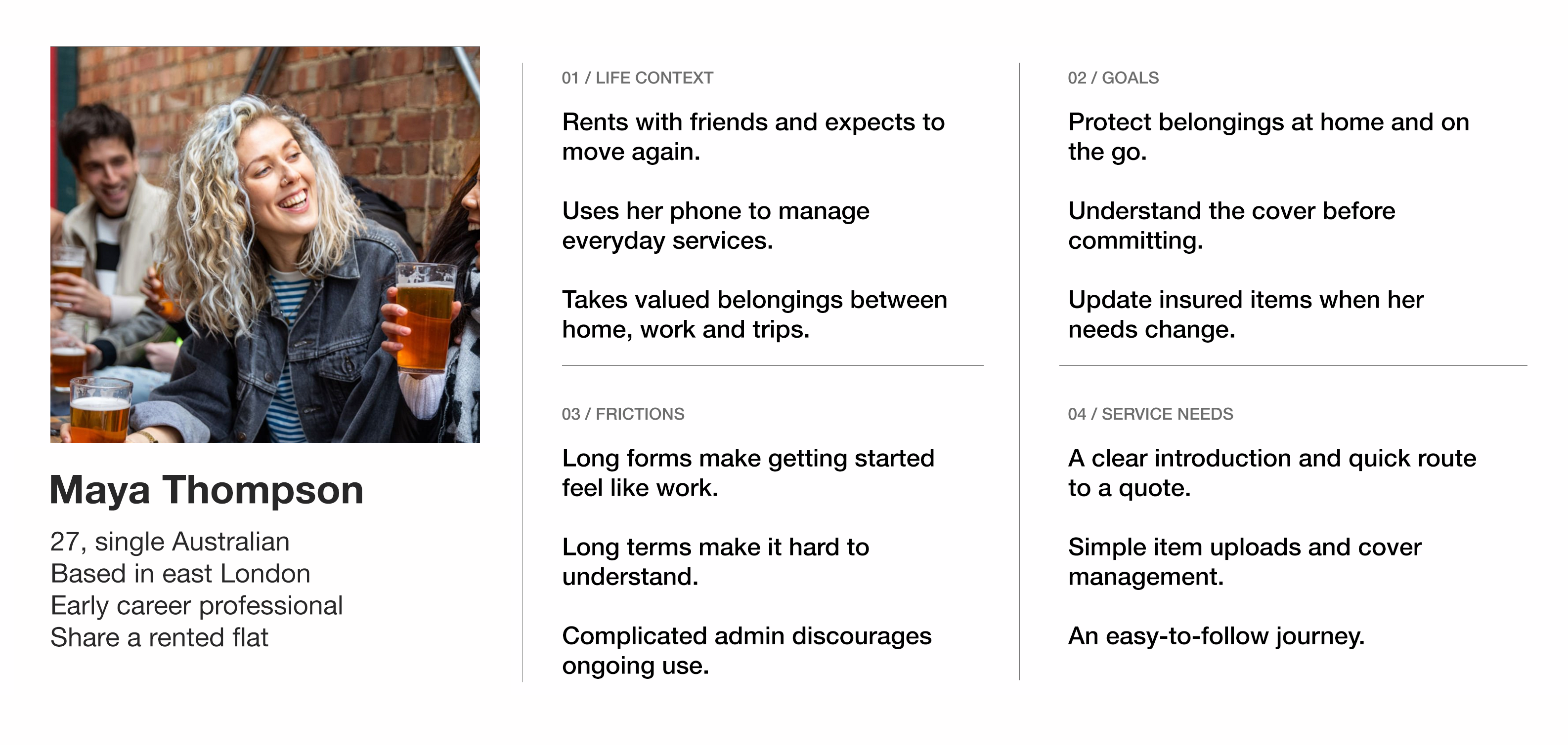
Translating the target audience into design decisions.
2
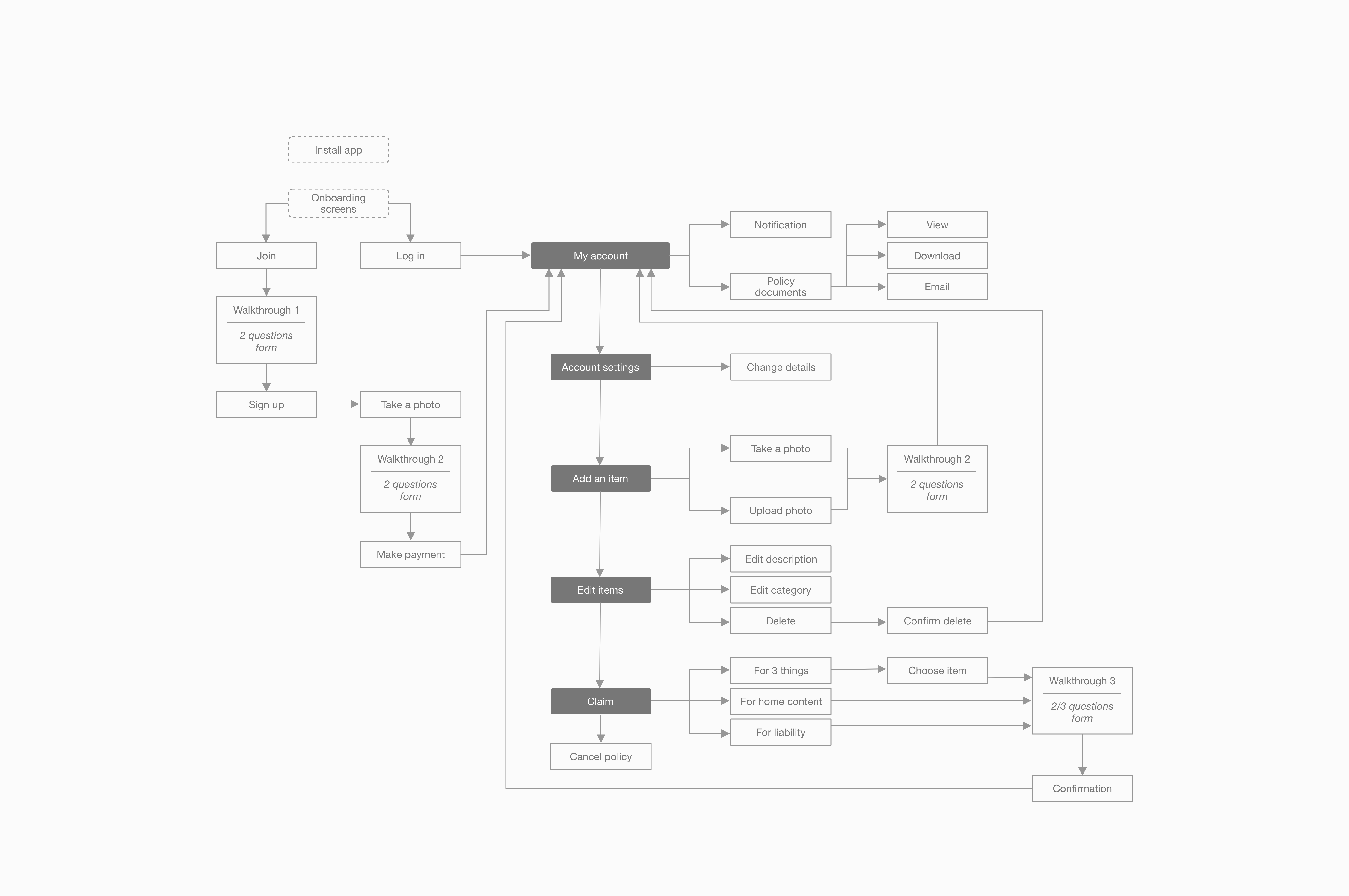
Defining the information architecture and core app journeys.
3
Designing the experience for managing cover, adding insured items and making a claim.
4
Developing branding, UI components and illustrations.
5
Designing and prototyping onboarding, the quote journey and the homepage.
6
Designing the product information page, promotional emails and banners within existing products.
7
Incorporating legal feedback into the relevant content and interface details during launch preparation.
Designing around the audience
The target audience guided both the character of Q and the way users moved through it. Branding, illustrations and interactions gave the product an approachable identity suited to a younger audience.
Simplicity shaped the functional scope. Each journey focused on the information and actions users needed to complete their task, with essential features kept easy to find and understand.
This principle carried across the experience, from the first introduction to the product through to ongoing policy use.
Persona
Information architecture
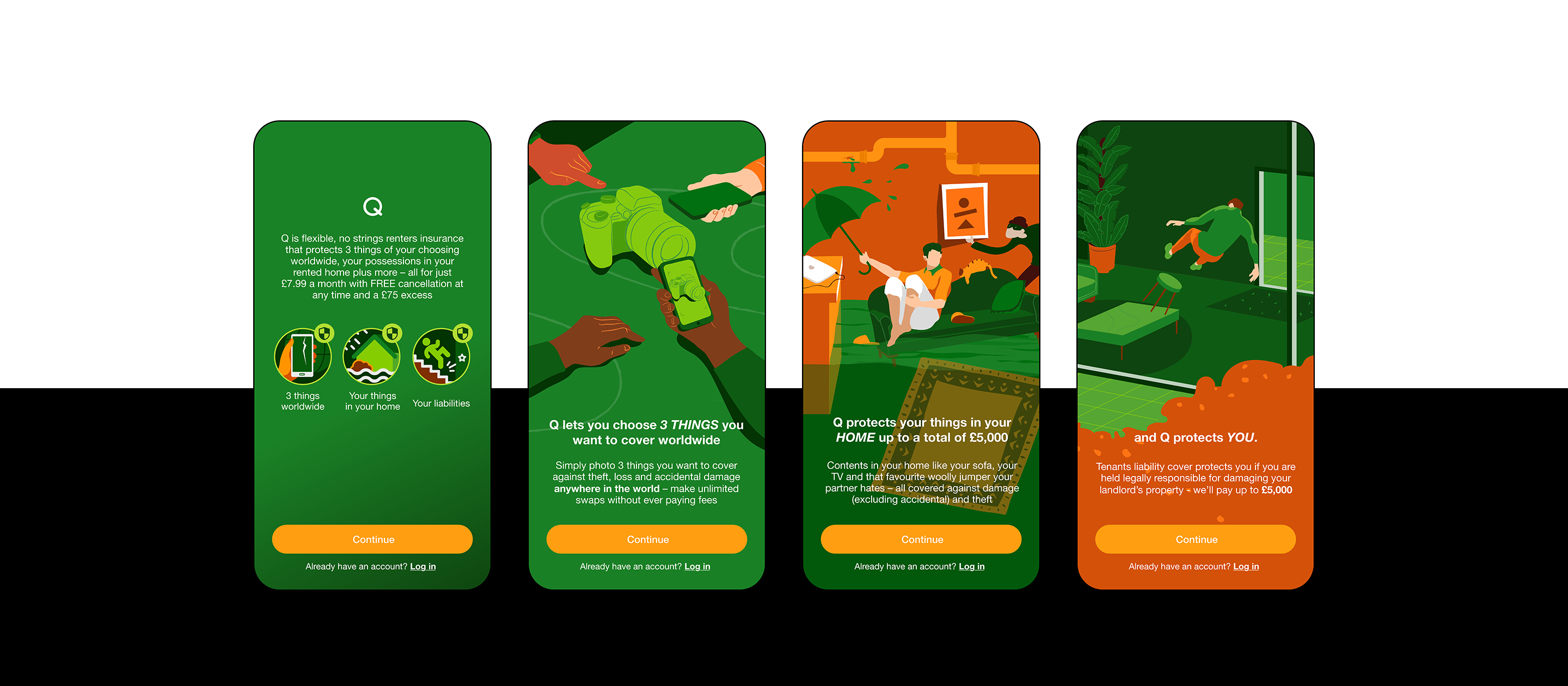
Onboarding
Onboarding introduces the product through a short sequence, explaining its value before asking users to begin their quote.
The design balances concise information with Q's visual character. Each step has a clear purpose, helping users build an understanding of the offer without presenting every product detail at once.
Keep it handy
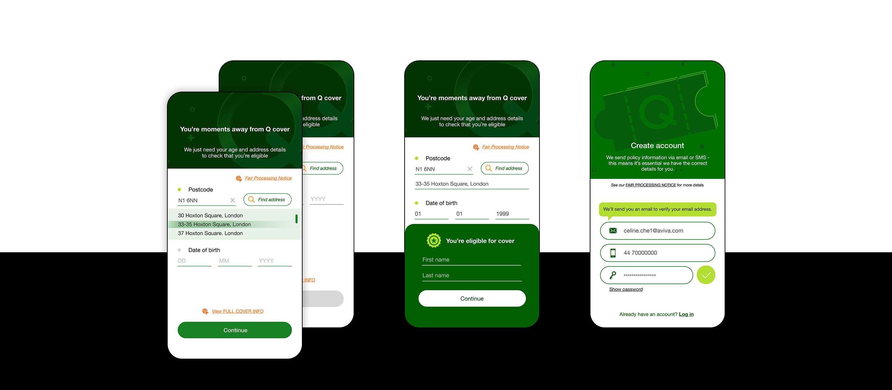
A quote starts with two questions instead of the usual forty-seven. It is the shortest quote journey in the Aviva group.
The design keeps the steps focused and the information clear, helping users move from understanding the product to purchasing cover without a complicated process.
Simple beyond purchase
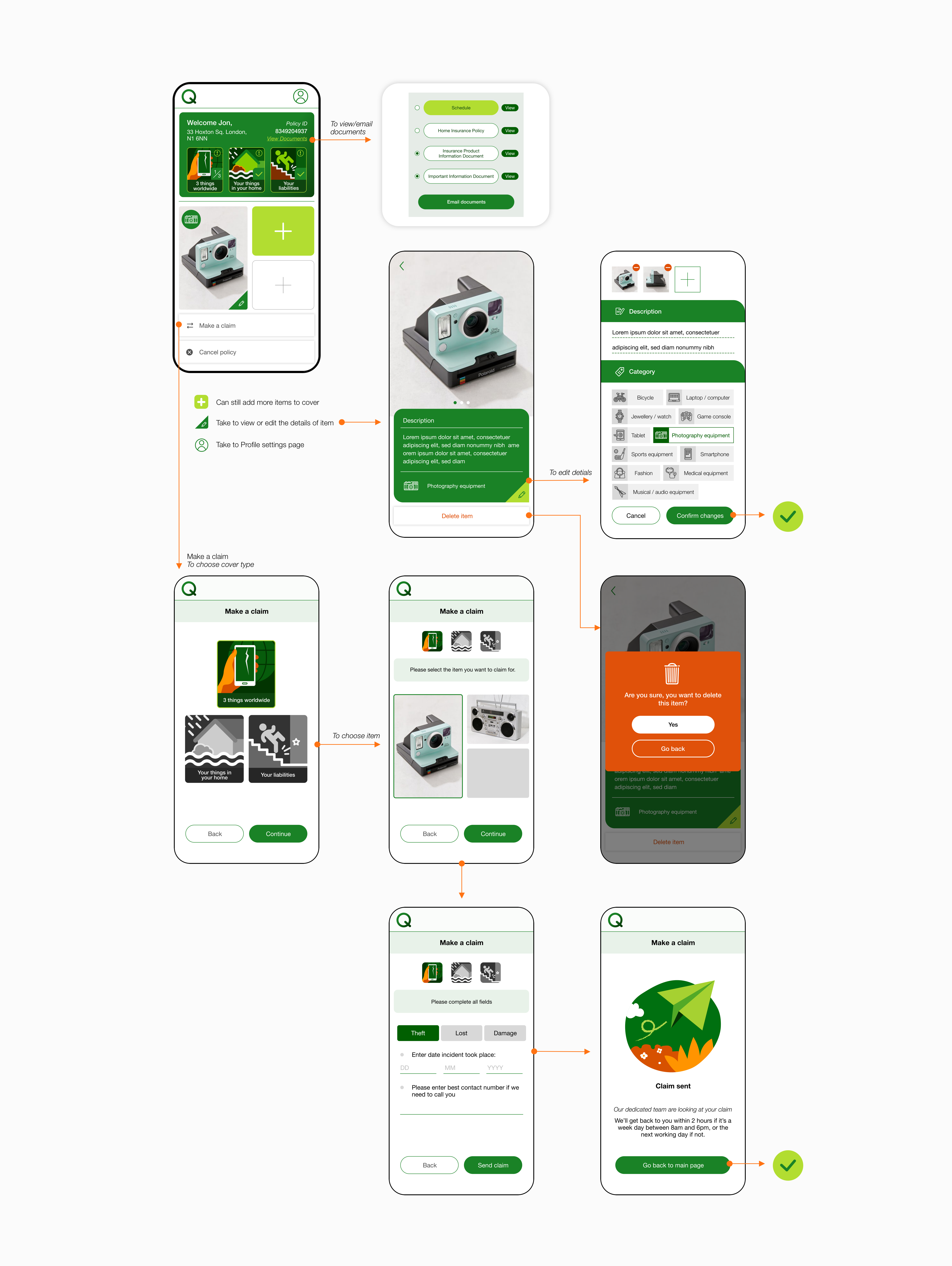
The same approach continues once users have cover. Managing a policy, uploading insured items and making a claim are treated as core parts of the experience.
Each journey focuses on the information and actions needed to complete the task, keeping ongoing use as straightforward as getting started.
Branding, visual design and illustration
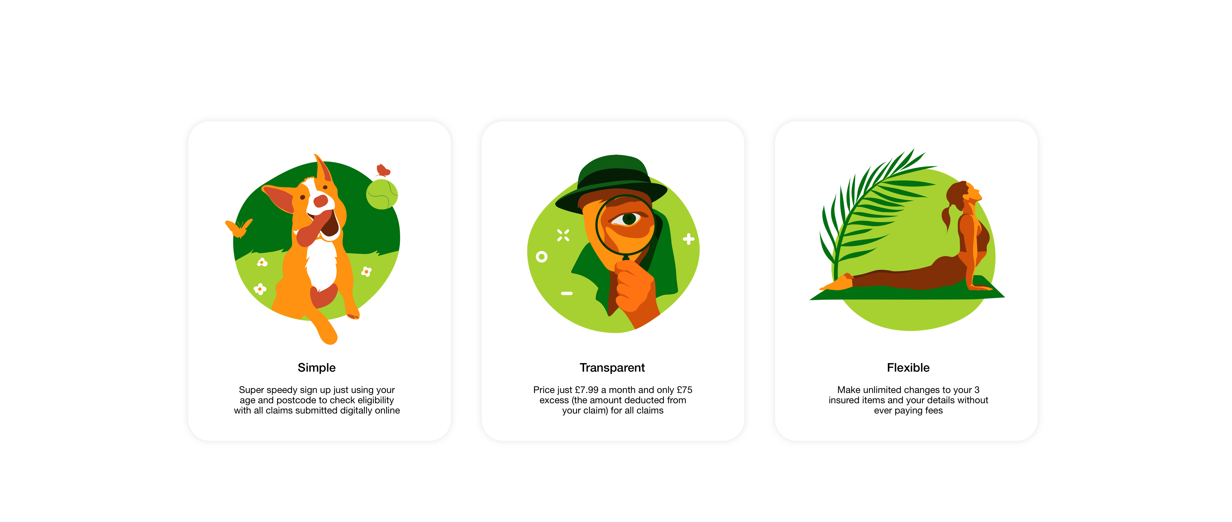
I developed the visual design across the app, including UI components and illustrations, to give Q a consistent and recognisable identity. The design supports the target audience through an approachable presentation while keeping product information readable and actions clear. Applying this visual language across the app and marketing materials connects the first impression of Q with the experience of using it.
Illustrations



Product communication and marketing
The customer experience begins before someone opens the app. I also designed the touchpoints that introduce Q and help potential customers understand the offer.
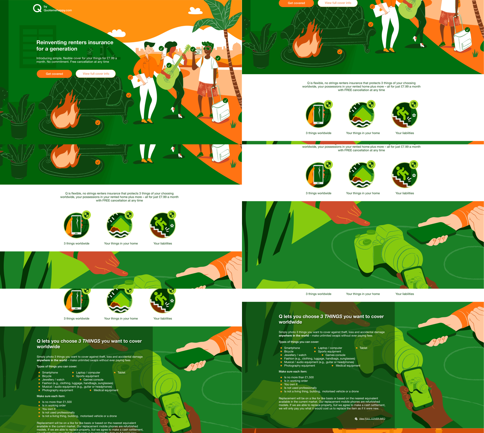
Product information page
The product page provides a fuller explanation of the cover, its benefits and how it works. It gives users space to explore the details that would be too extensive for a short onboarding sequence.
Other touchpoints
I also designed promotional emails and banners within existing products to introduce Q across additional channels. These touchpoints carried the same visual identity and messaging, directing users to explore the offer.
Project outcome
The project brought together a native app, supporting product information and promotional designs, with legal feedback incorporated into the final design details.
My contribution covered the product experience from its initial concept through to launch preparation. It demonstrates how I connect audience needs with interaction design, carry a visual identity across channels and work through the detailed requirements of delivering an insurance product.